Analyzing Cape Town's day zero with Global Water Watch's API in Python
We learned from end-users that many use cases require an open and programmable interface to our data. Researchers and users that wish to conduct their own analysis or build their own application or dashboard on top of GWW can now start developing. Our first dataset is now entirely accessible via an Application Programming Interface (API).

Hessel Winsemius
Lead Hydrologist,Deltares
Use case: humanitarian aid
The Red Cross 510, a data analytics branch of the Red Cross, seated in The Hague the Netherlands, builds their own in-house dashboards. With these, they support Red Cross Societies in several countries with early warning and early action for droughts using many different data sources such as remotely sensed vegetation indices, global meteorological forecasts, and flow forecast models (GloFAS). They combine this with local knowledge on what entails a critical condition for the targeted region and consolidate the pieces of information in data-driven prediction models. They create a dashboard to show the forecast information in a manner that is understandable for the end user, and a drought (or flood) early action protocol to guide responses to the information provided. Hence, 510 is a good example of an end user requiring programmable access to our data.
In Nature Scientific Reports, we recently demonstrated that Global Water Watch may provide essential information in areas that strongly rely on surface water resources for e.g. food production or -especially in urban areas- drinking water supply. Could you imagine that a condition such as the 2018 drought around Cape Town, which almost lead to zero water availability, would occur in an area more remotely and less well monitored? Global Water Watch should be able to detect this at an early stage and provide key insights in the available water already at the start of the growing season and potentially inform stakeholders such as the Red Cross. We performed such an analysis in the paper for the Cape Town drought. And here we redo the analysis with our new API as a demonstration of our current capabilities.
Cape Town's Day Zero reservoir dynamics
Here, we show a video of the situation before (2015), during (2017-2018) and after (until 2021) the most critical moment as analyzed with data retrieved from the API. This is the end result of the analysis, and as a python coder, you can entirely redo this analysis yourself. The colored dots' size corresponds to the average size of the reservoirs and the colors show how many standard deviations the surface area deviates from the normal situation in the given month (surface area index). The red line in the inset shows how the surface area index behaves with all surface area in the chosen reservoirs combined. In the remainder we provide an overview of the steps we took to analyze this with the API.
Let's do some coding
We first wrote a small function that calls an end point /reservoir/geometry which extracts reservoirs, their water body outline as mapped by one of our used sources such as Global Dam Watch or OpenStreetMap. The function can use any polygon shape such as a bounding box, a country shape or a river basin as input. This allows for a very simple way of collecting aggregated results over areas that are important to a user.
def get_reservoirs_by_geom(geom, base_url=base_url):
    """
    Gets reservoirs from API. Return dict with IDs.

    """
    url = f"{base_url}/reservoir/geometry"
    # do post request to end point with the serialized geometry as post data
    return requests.post(url, data=geom)
Extracting reservoirs around Cape Town
We applied this function using a rough bounding box (converted into a geojson string) around Cape Town. We use geopandas to make the results applicable for geospatial plotting in matplotlib.
xmin, ymin, xmax, ymax = (17.948, -34.6538, 19.7361, -33.6857)
# we prepare a geometry from the coordinate with shapely.geometry.box
bbox = box(xmin, ymin, xmax, ymax)
# to pass this to our API, the geometry needs to be serialized to a json, so we first turn it into a dictionary
# and then turn it into a string
json_dict = mapping(bbox)
json_str = json.dumps(json_dict)
# show the geojson
print(json_str)
'{"type": "Polygon", "coordinates": [[[19.7361, -34.6538], [19.7361, -33.6857], [17.948, -33.6857], [17.948, -34.6538], [19.7361, -34.6538]]]}'r = get_reservoirs_by_geom(json_str)
# convert into geopandas.GeoDataFrame
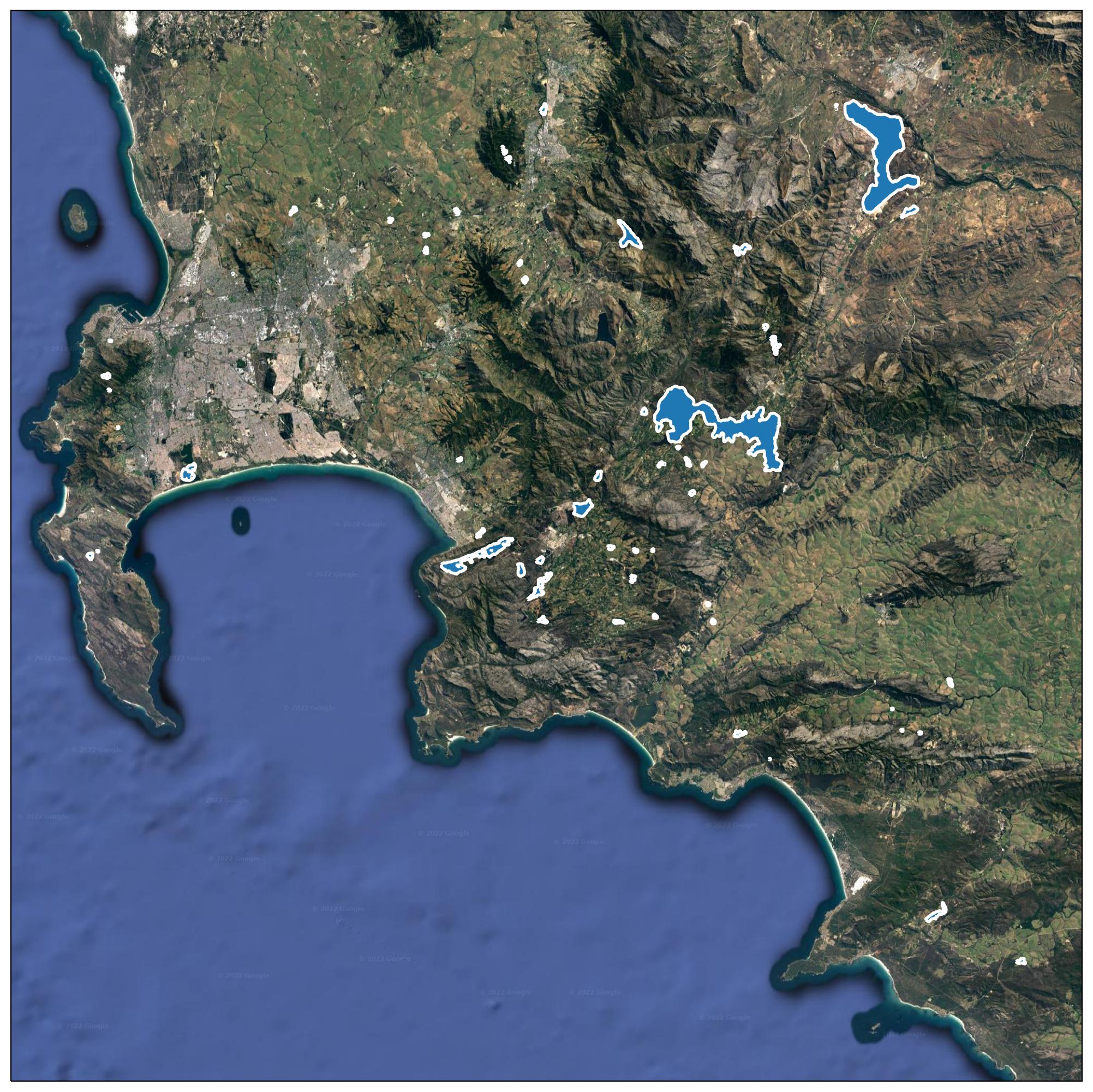
gdf = to_geopandas(r.json())60 reservoirs were found and here we show a simple geospatial plot that identifies the location of the reservoirs in shapes with blue filled areas and white outlines (the code for plotting this is included in the jupyter notebook.
Retrieving surface area time series
We wanted to retrieve the data for all the polygons shown. We also wrote a small function to retrieve a time series for a given reservoir with a user provided reservoir identifier code and applied that on all 60 reservoir identifiers. The start and stop parameters are used to define start and end dates. We picked a 20-year period to analyze how much a current situation deviates from a normal situation.
def get_reservoir_ts(reservoir_id, start=start, stop=stop):
"""
Get time series data for reservoir with given ID
"""
url = f"{base_url}/reservoir/{reservoir_id}/ts"
params = {
"start": start.strftime("%Y-%m-%dT%H:%M:%S"),
"stop": stop.strftime("%Y-%m-%dT%H:%M:%S")
}
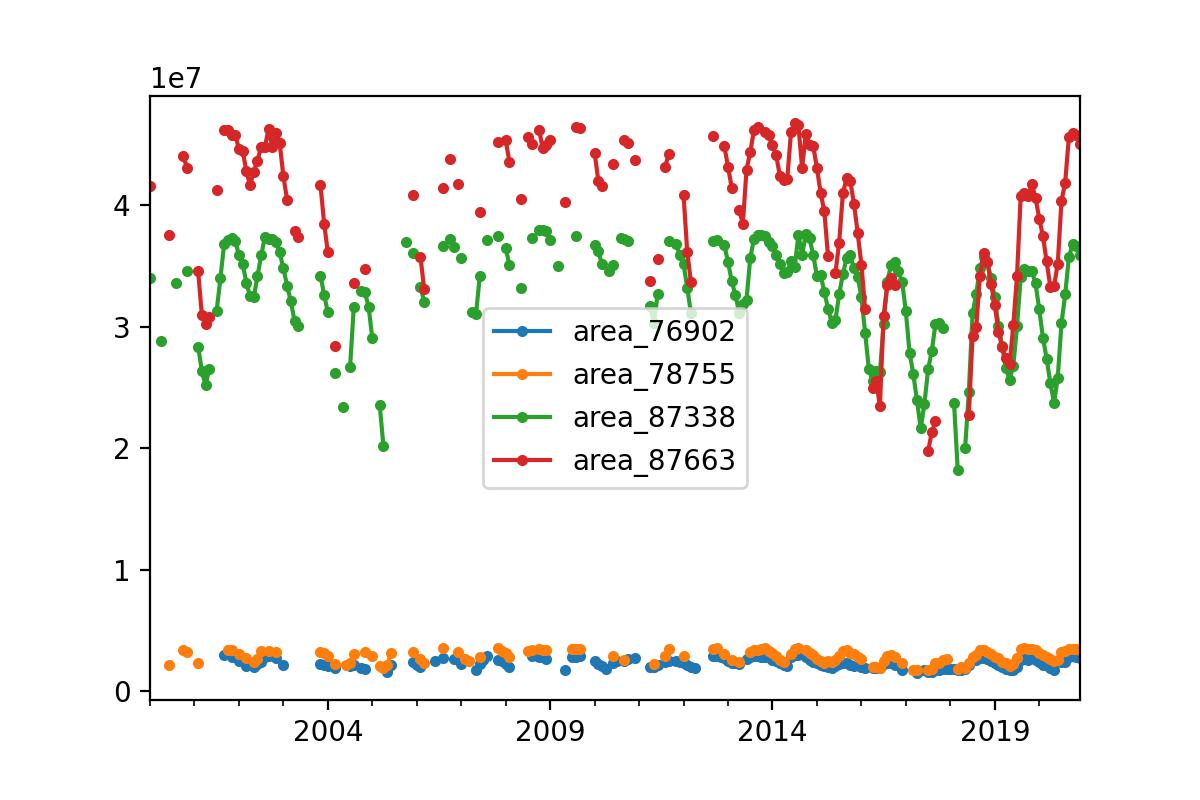
return requests.get(url, params=params)The time series library pandas is very powerful, and in the notebook we use pandas to create monthly means and concatenate all data into one table.
# resample data for each reservoir to monthly means and concatenate to a new pandas.DataFrame
data_monthly = pd.concat([data.resample("MS").mean() for data in data_per_reservoir], axis=1)
# plot the last 4 (the largest)
data_monthly.iloc[:, -4:].plot(marker=".")
The last line plots the 4 largest reservoirs. The result is shown below. It shows clearly that the end of 2017 and start of 2018 were the worst condition seen in the entire 20-year series.
Comparison of surface area compared to what is "normal"
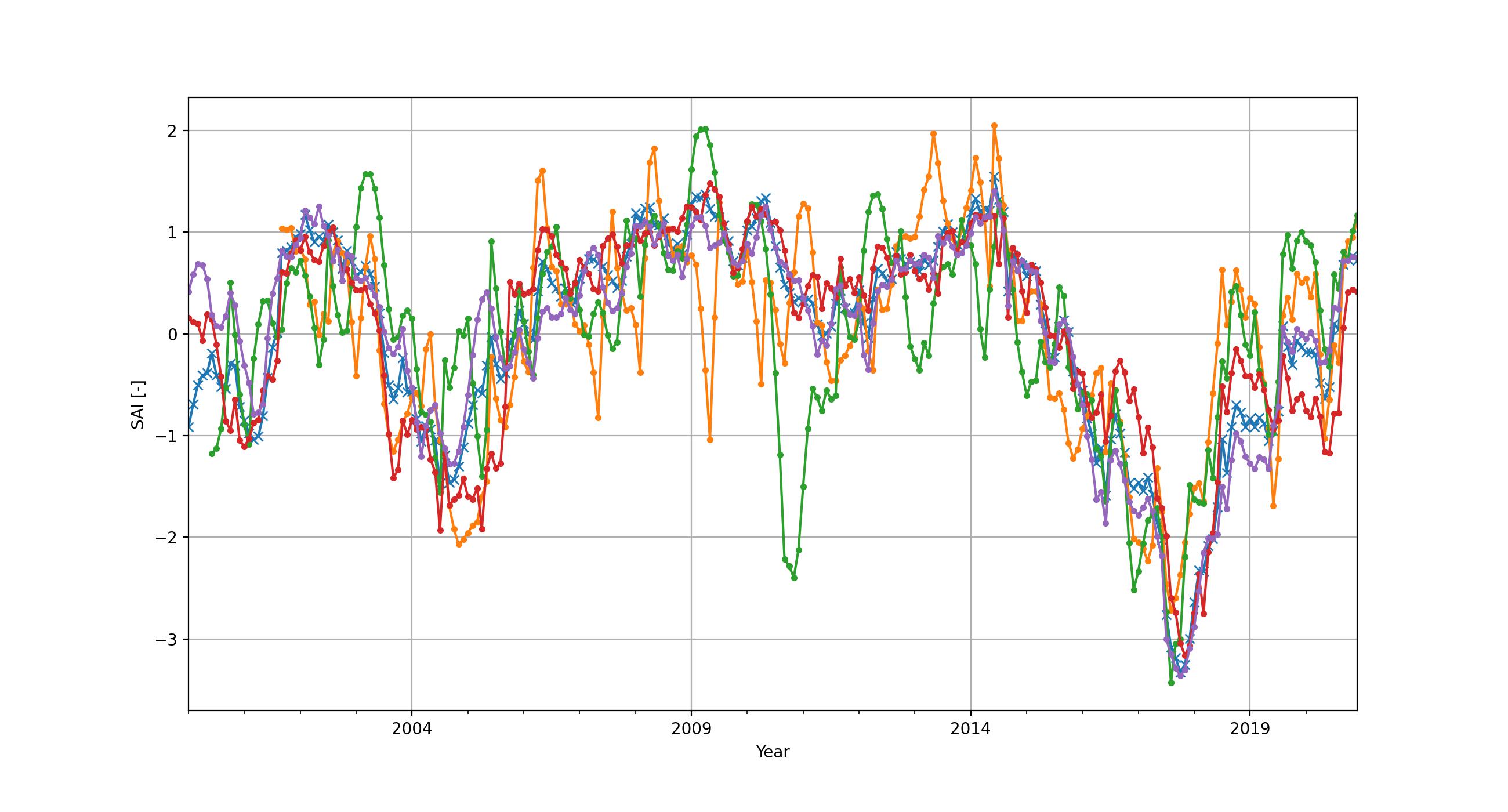
How to compare one reservoir against another? And how to estimate how 'bad' the situation is compared to normal expected climatological conditions? For this standardized indices can be used. This approach is often used with precipitation, and the index used is also known as "Standardized Precipitation Index". We here use the exact same approach to derive a "standardized area index" (SAI). We made some functions (see the accompanied Jupyter notebook) to create monthly climatologies, transform these climatologies to a standard normal distribution and then map each individual data point to the standard normal distribution for the given month. Essentially the result demonstrates month-by-month anomalies of the reservoir surface areas. Below we show the same 4 reservoirs, but then with the SAI applied. It shows that all reservoirs are more or less equally in trouble early 2018.
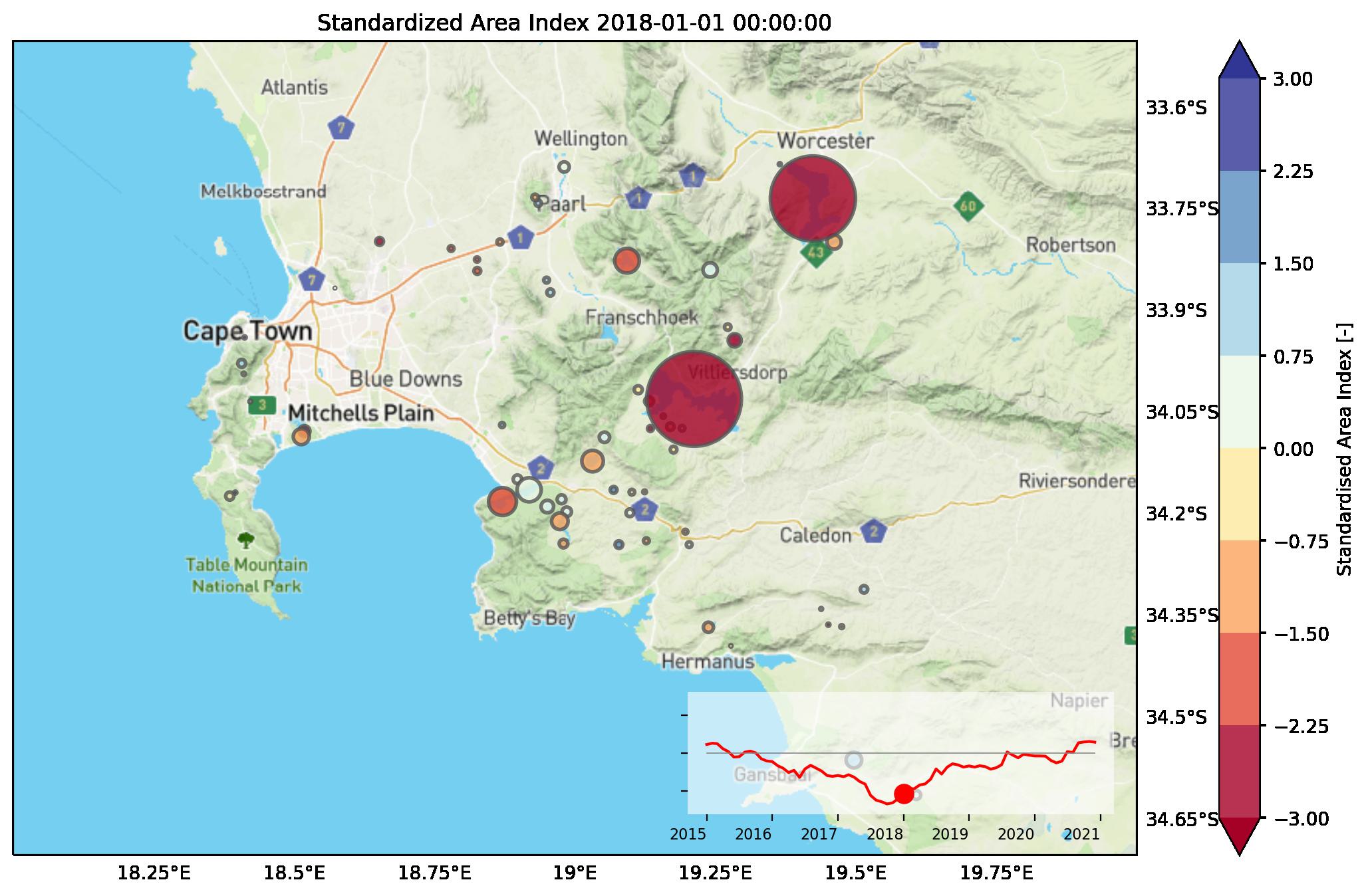
Situation January 2018
Finally, to see if the entire region is in trouble, we made a spatial representation of the data, as shown in the video on top, and in this snapshot of January 2018. The size of the dots represents the average area of the underlying reservoir. The color represents the amount of standard deviations from normal. Dark red means that the situation is very bad, with at least two standard deviations below normal for the given month. This information could clearly have been used to inform large scale drought issues, and to engage with stakeholders or mobilize resources at an early stage, especially in areas that are less well reported on than Cape Town such as remote, or less developed regions.
So what's next?
Our team is working hard on Global Water Watch's features. Updates to the API will include disclosing more variables, such as reservoir volumetric storage time series in cubic metres (note that the above analysis is based on water surface area), monthly fitted or averaged data, error bars around surface area and storage, and pre-calculated statistics such as the surface area index presented here. This will allow a user to much more rapidly access the information required for decision making.
So can I use this for my research, analysis or use case?
Yes you can! The API as openly available via https://api.globalwaterwatch.earth/ and all the analyses, charts and maps shown in this notebook are available in a notebook which you can access via GitHub or directly open and execute in Google Colab.